Can you guess the weight of this bull? What about you and 99 friends?
1 Describing the shape of data
Learning Objectives
By the end of this lesson, you will be able to:
Create and use a histogram to evaluate data distribution
Identify Gaussian data (that ain’t normal)
Identify Poisson data
Identify Binomial data
Diagnose commondata distributions
Overview
I. A curve has been found representing the frequency distribution of standard deviations of samples drawn from a normal population. II. A curve has been found representing the frequency distribution of values of the means of such samples, when these values are measured from the mean of the population in terms of the standard deviation of the sample
- Gosset. 1908, Biometrika 6:25.
The idea of sampling underpins traditional statistics and is fundamental to the practice of statistics. The basic idea is usually that there is a population of interest, which we cannot directly measure. We sample the population in order to estimate the real measures of the population. Because we merely take samples, there is error assiociated with our estimates and the error depends on both the real variation in the population, but also on chance to do with which subjects are actually in our sample, as well as the size of our sample. Traditional statistical inference within Null Hypothesis Significance Testing (NHST) exploits our estimates of error associated with our samples. While this is an important concept, it is beyond the scope of this page to review it, but you may wish to refresh your knowledge by consulting a reference, such as Irizarry 2020 Chs 13-16.
In this page, we will briefly look at some diagnostic tools in R for examining the distribution of data, and talk about a few important distributions that are common to encounter.
2 Use of the histogram
The histogram is a graph type that typically plots a numeric variable on the x axis (either continuous numeric values, or integers), and has the frequency of observations on the y axis (i.e., the count), or sometimes the proportion of observation on the y axis.
2.1 Typical histogram for continuous variable
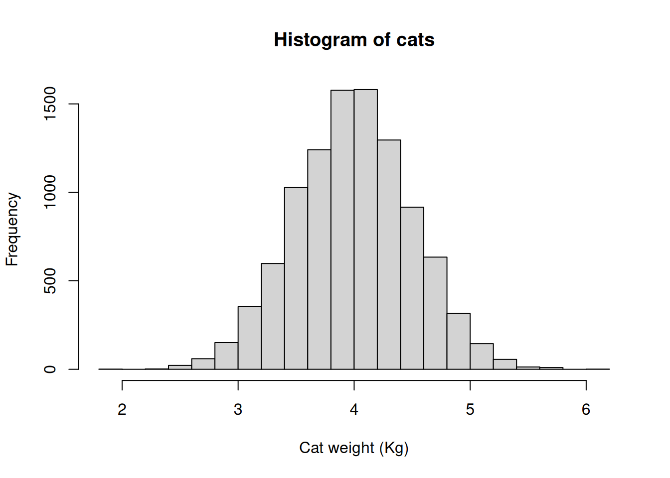
# Try this:# Adult domestic cats weight approximately 4 Kg on average# with a standard deviation of approximately +/1 0.5 Kg# Let's simulate some fake weight data for 10,000 catshelp(rnorm)# A very useful functionhelp(set.seed)# If we use this, we can replicate "random data"help(hist)
set.seed(42)cats<-rnorm(n =10000, # 10,000 cats mean =4, sd =0.5)cats[1:10]# The first 10 cats
The bars are the count of the number of cats at each weight on the x axis
The width of each vertical column is a (non-overlapping) range of weights - these are called “bins” and can be defined, but usually are automatically determined based on the data
For count data, each bar is usually one or more integer values, rather than a range of continuous values (as it is for cat weight above in the figure)
The shape of a histogram can be used to infer the distribution of the data
2.2 Sampling and populations
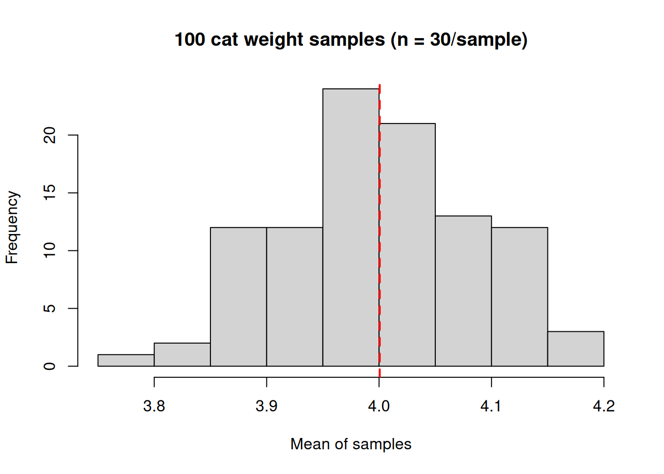
Remember the concept of population versus sample? Well, let’s assume there are only 10,000 cats in the whole world and we just measured the whole population (usually not possible, remember). In this case we can calculate the exact population mean.
What if we tried to estimate the real mean of our population from a sample of around 100 cats? The theory is that our sample mean would be expected to differ from the real population mean randomly. If we did a bunch of samples, most of the guesses would be close to the real population mean and less would be farther out, but all of these sample means would be expected to randomly vary, either less than or greater than the true population mean. We can examine this with a simulation of samples.
# Try this:# simulation of sampleshelp(sample)# randomly sample the cats vectorhelp(vector)# Initialize a variable to hold our sample means
# We will do a "for loop" with for()mymeans<-vector(mode ="numeric", length =100)mymeans# Empty
for(iin1:100){mysample<-sample(x =cats, # Takes a random sample size =30)mymeans[i]<-mean(mysample)# stores sample mean in ith vector address}mymeans# Our samples
hist(x =mymeans, xlab ="Mean of samples", main ="100 cat weight samples (n = 30/sample)")abline(v =mean(mymeans), col ="red", lty =2, lwd =2)
Notice a few things (NB your results might look slightly different to mine - remember these are random samples):
The samples vary around the true mean of 4.0 Kg
Most of the samples are pretty close to 4.0, fewer are farther away
The mean of the means is close to our true population mean
Try our simulation a few more times, but vary the settings. How does adjusting the sample size (say up to 100 or down to 10)? How about the number of samples (say up to 1000 or down to 10)?
3 Gaussian: That ain’t necessarily normal!
The Gaussian distribution is sometimes referred to as the Normal distribution. This is not a good practice: do not refer to the Gaussian distribution as the Normal distribution. Referring to the Gaussian distribution as the normal distribution implies that Gaussian is “typical”, which is patently untrue.
- The Comic Book Guy, The Simpsons
The Gaussian distribution is the classic “Bell curve” shaped distribution. It is probably the most important distribution to master, because of its importance in several ways:
We expect continuous numeric variables that “measure” things to be Gaussian (e.g., human height, lamb weight, songbird wing length, Nitrogen content in legumes, etc., etc.)
For linear models like regression and ANOVA (we will review these models), we assume the residuals (the difference between each observation and the mean) to be Gaussian distributed and we often must test and evaluate this assumption
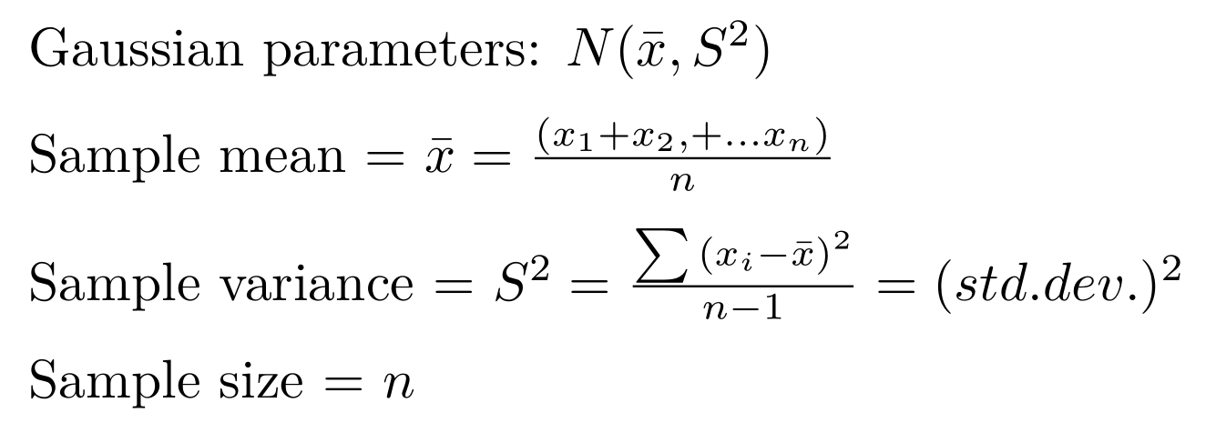
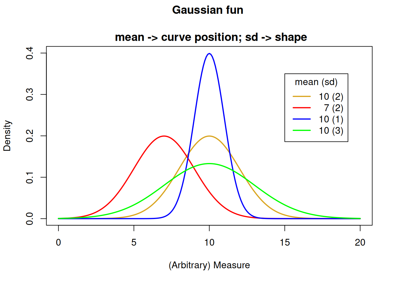
The Gaussian is described by 2 quantities: the mean and the variance
We can describe the expected perfect (i.e., theoretical) Gaussian distribution based just on the mean and variance. The value of this mean and variance control the shape of the distribution.
# Make a baseline plotx<-seq(0,20, by =.1)# Probabilities for our first mean and sdy1<-dnorm(x =x, mean =meanvec[1], sd =sdvec[1])# Baseline plot of 1st mean and sdplot(x =x, y =y1, ylim =c(0, .4), col ="goldenrod", lwd =2, type ="l", main ="Gaussian fun \n mean -> curve position; sd -> shape", ylab ="Density", xlab ="(Arbitrary) Measure")# Make distribution linesmycol<-c("red", "blue", "green")for(iin1:3){y<-dnorm(x =x, mean =meanvec[i+1], sd =sdvec[i+1])lines(x =x, y =y, col =mycol[i], lwd =2, type ="l")}# Add a legendlegend(title ="mean (sd)", legend =c("10 (2)", " 7 (2)", "10 (1)", "10 (3)"), lty =c(1,1,1,1), lwd =2, col =c("goldenrod", "red", "blue", "green"), x =15, y =.35)
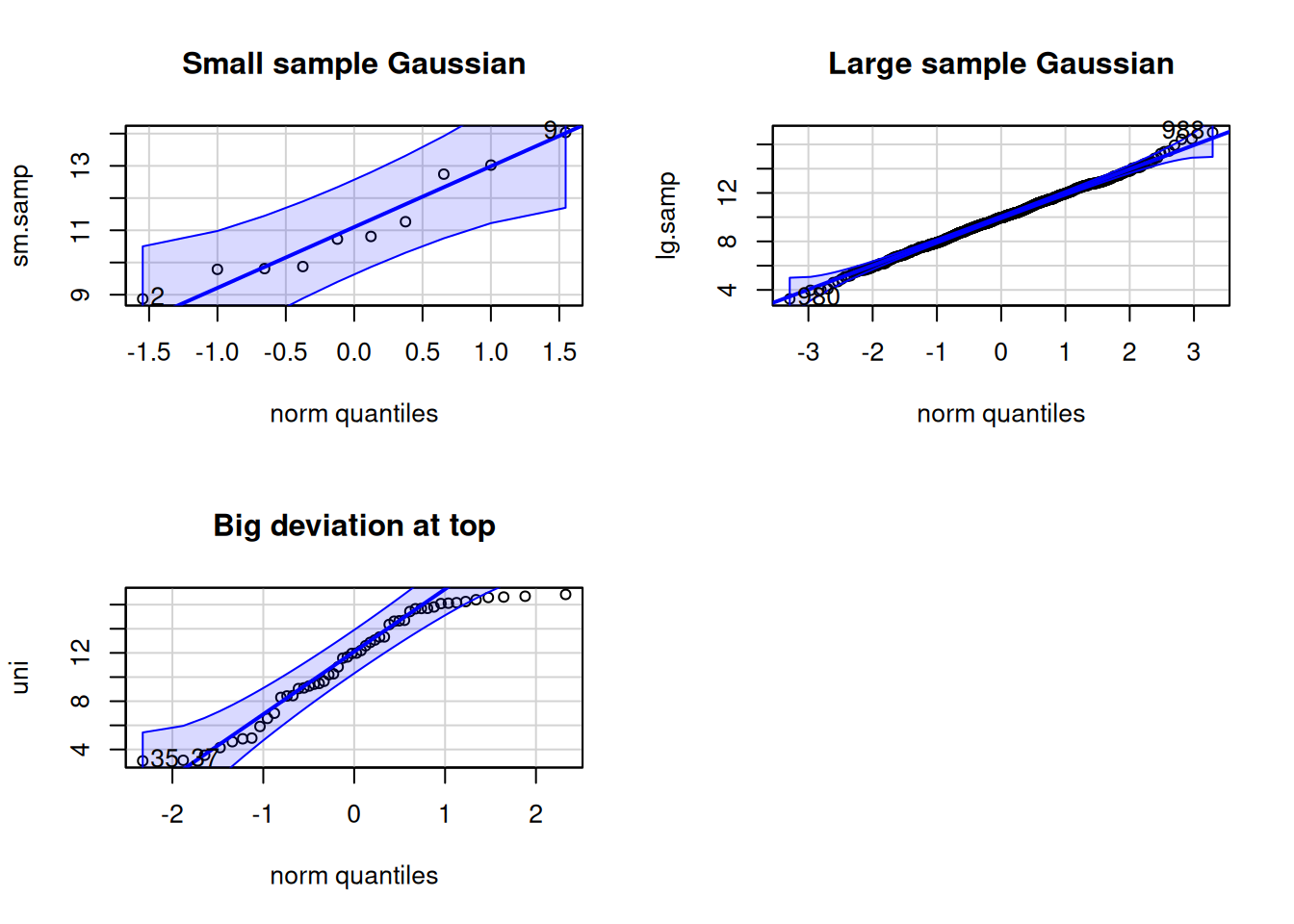
3.4 Quartile-Quartile (Q-Q) plots
It is very often that you might want a peek or even more formally test whether data are Gaussian. This might be in a situation when looking at, for example, the residuals for a linear model to test whether they adhere to the assumption of a Gaussian distribution. In that case, a common diagnostic graph to construct is the quantile-quantile, or “q-q”” Gaussian plot.
The q-q Gaussian plot your data again the theoretical expectation of the “quantile”, or percentile, were your data perfectly Gaussian (a straight, diagonal line). Remember, samples are not necessarily expected to perfectly conform to Gaussian (due to sampling error), even if the population from which the sample was taken were to be perfectly Gaussian. Thus, this is a way to confront your data with a model, to help be completely informed. The degree to which your data deviates from the line (especially systematic deviation at the ends of the line of expectation), is the degree to which is deviates from Gaussian.
## q-q- Gaussian ##### Try This:library(car)# Might need to install {car}
Loading required package: carData
# Set graph output to 2 x 2 grid# (we will set it back to 1 x 1 later)par(mfrow =c(2,2))# Small Gaussian sampleset.seed(42)sm.samp<-rnorm(n =10, mean =10, sd =2)qqPlot(x =sm.samp, dist ="norm", # C'mon guys, Gaussian ain't normal! main ="Small sample Gaussian")
[1] 9 2
# Large Gaussian sampleset.seed(42)lg.samp<-rnorm(n =1000, mean =10, sd =2)qqPlot(x =lg.samp, dist ="norm", main ="Large sample Gaussian")
[1] 988 980
# Non- Gaussian sampleset.seed(42)uni<-runif(n =50, min =3, max =17)qqPlot(x =uni, dist ="norm", main ="Big deviation at top")
Life is good for only two things, discovering mathematics and teaching mathematics.
- Simeon-Denis Poisson
The description of the Poisson distribution was credited to Simeon-Denis Poisson, a (very, very) passionate mathematician. The classic example for use is for count data, where famously it was exemplified by the number of Prussian soldiers who were killed by being kicked by a horse in a particular year.
4.1 The Poisson distribution
Count data of discrete events, objects, etc.
Integers, for example the number of beetles caught each day in a pitfall trap:
Described by a single parameter, \(\lambda\) (lambda), which describes the mean and the variance
The Poisson parameter:
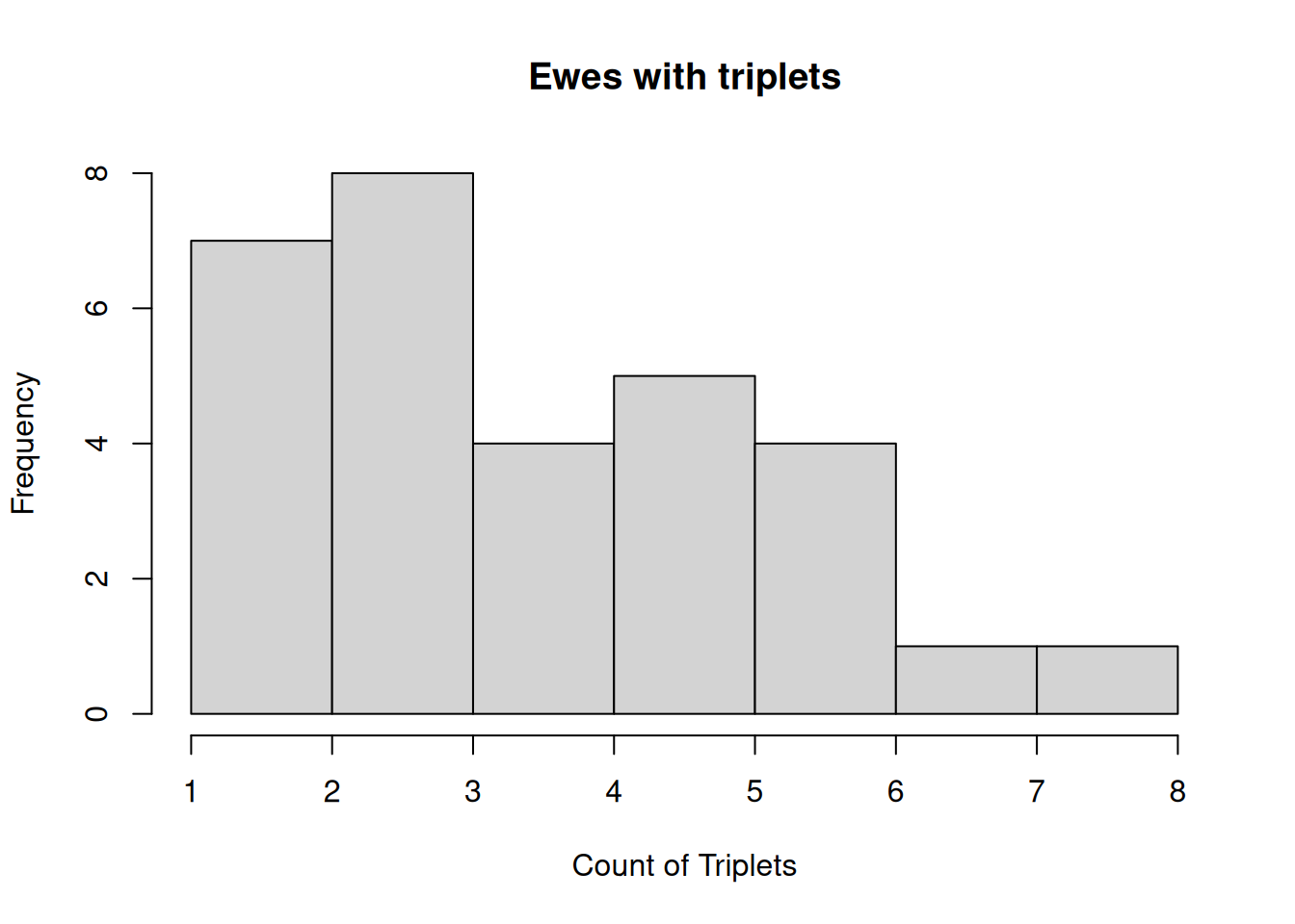
4.2 Example Poisson data
# Try this:# E.g. (simulated) Number of ewes giving birth to triplets# The counts were made in one year 1n 100 similar flocks (<20 ewes each)set.seed(42)mypois<-rpois(n =30, lambda =3)hist(mypois, main ="Ewes with triplets", xlab ="Count of Triplets")
4.3 Density plot for different Poisson lambda values
# Make a baseline plotx<-seq(0, 15, by =1)# Probabilities for our first lambday1<-dpois(x =x, lambda =lambda[1])# Baseline plot Poisplot(x =x, y =y1, ylim =c(0, .4), col ="goldenrod", lwd =2, type ="b", main ="Poisson fun", ylab ="Density", xlab ="(Arbitrary) Count")# Make distribution linesmycol<-c("red", "blue")for(iin1:2){y<-dpois(x =x, lambda =lambda[i+1])lines(x =x, y =y, col =mycol[i], lwd =2, type ="b")}# Add a legendlegend(title ="lambda", legend =c("1", "3", "5"), lty =c(1,1,1,1), lwd =2, col =c("goldenrod", "red", "blue"), x =8, y =.35)
5 Binomial
When faced with 2 choices, simply toss a coin. It works not because it settles the question for you, but because in that brief moment when the coin is in the air you suddenly know what you are hoping for.
The Binomial distribution describes data that has exactly 2 outcomes: 0 and 1, Yes and No, True and False, etc. (you get the idea).
Examples of this kind of data include things like flipping a coin (heads or tails), successful germination of seeds (success or failure), or binary behavioral decisions (remain or disperse)
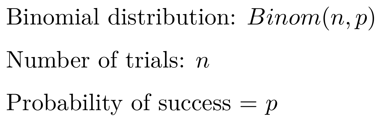
5.1 The Binomial distribution:
Data are the count of “successes”” in (binary) outcomes of a series of independent events
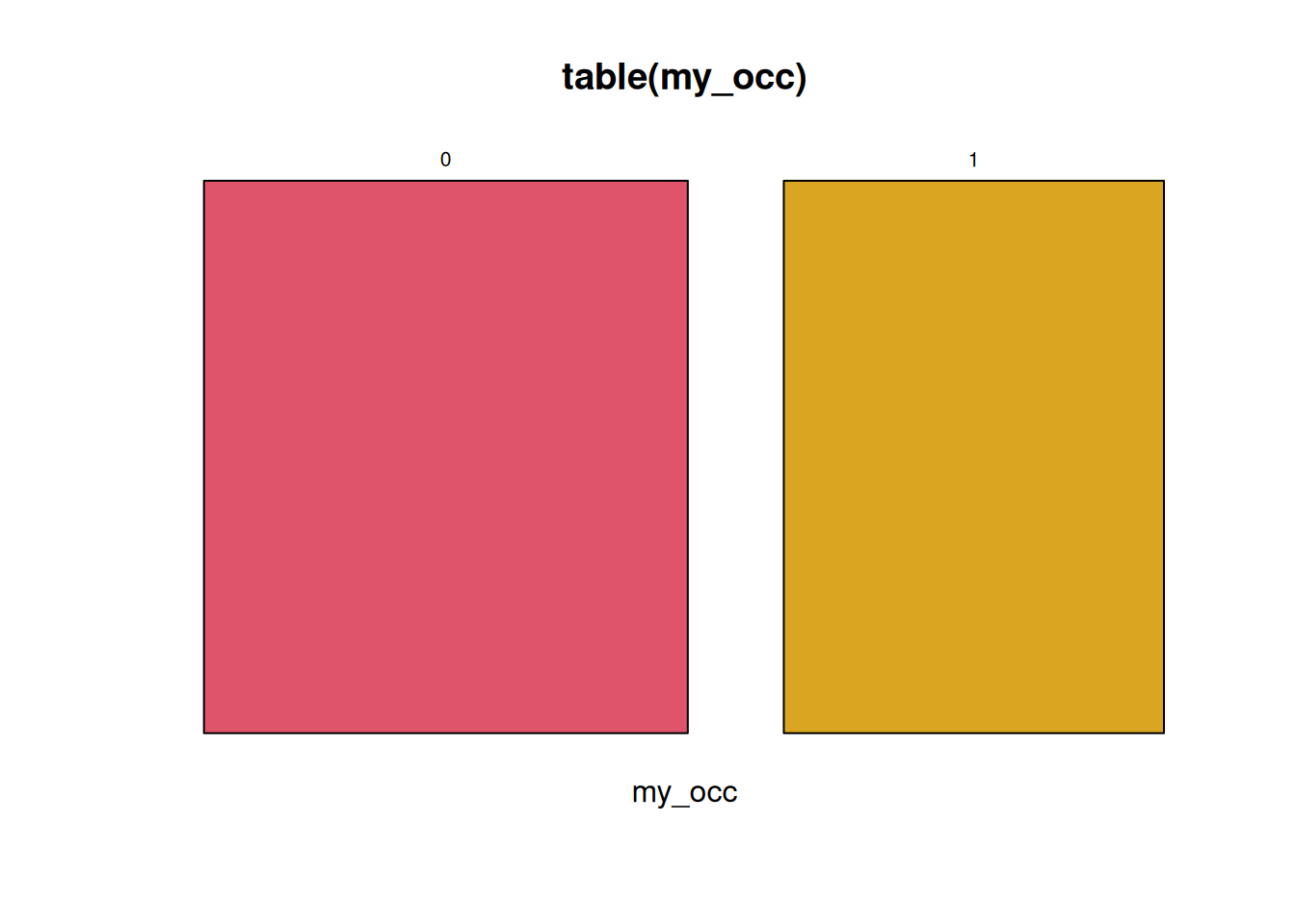
Let’s say you check 50 nest boxes, there is exactly 1 result per nest box (occupied or not), and the probability of occupancy is 30%.
# Try this:# dormouse presence:set.seed(42)(my_occ<-rbinom(n =50, # Number of "experiments", here nestboxes checked size =1, # Number of checks, one check per nestbox prob =.3))# Probability of presence
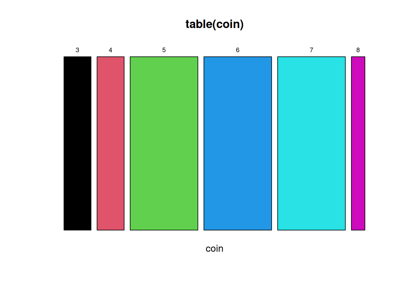
# Try this:# Flip a fair coin:set.seed(42)(coin<-rbinom(n =20, # Number of "experiments", 20 people flipping a coin size =10, # Number of coin flips landing on "heads" out of 10 flips per person prob =.5))# Probability of "heads"
Warning in 1:unique(coin): numerical expression has 6 elements: only the first
used
Described by 2 parameters, The number of trials with a binary outcome in a single “experiment” (\(n\)), and the probability of success for each binary outcome (\(p\)).
The Binomial parameters:
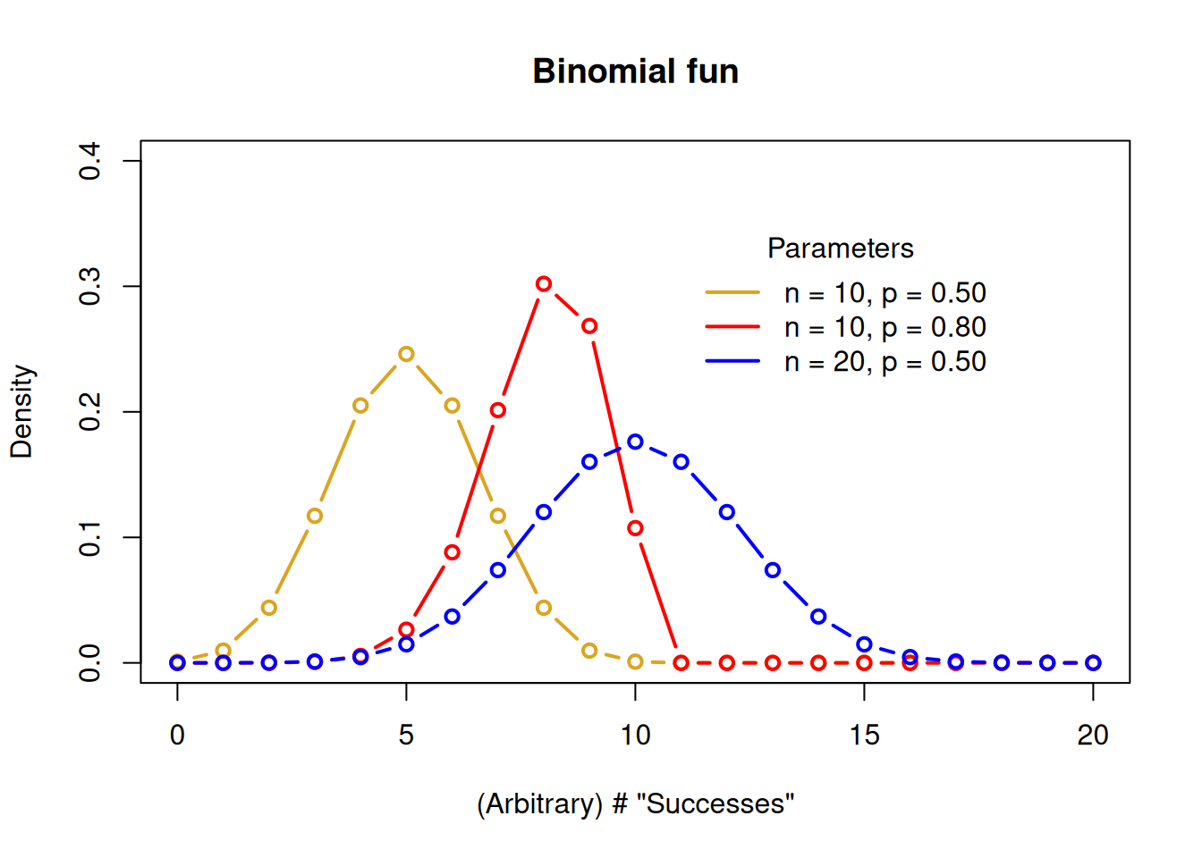
5.4 Density plot for different Binomial parameters
# Try this:# Binomial parameters# 3 n of trial values(n<-c(10, 10, 20))
# Make a baseline plotx<-seq(0, 20, by =1)# Probabilities for our first set of parametersy1<-dbinom(x =x, size =n[1], prob =p[1])# Baseline plot Binomplot(x =x, y =y1, ylim =c(0, .4), col ="goldenrod", lwd =2, type ="b", main ="Binomial fun", ylab ="Density", xlab ="(Arbitrary) # \"Successes\"")# Make distribution linesmycol<-c("red", "blue")for(iin1:2){y<-dbinom(x =x, size =n[i+1], prob =p[i+1])lines(x =x, y =y, col =mycol[i], lwd =2, type ="b")}# Add a legendlegend(title ="Parameters", legend =c("n = 10, p = 0.50", "n = 10, p = 0.80","n = 20, p = 0.50"), lty =c(1,1,1,1), lwd =2, bty='n', col =c("goldenrod", "red", "blue"), x =11, y =.35)
6 Diagnosing the distribution
A very common task faced when handling data is “diagnosing the distribution”. Just like a human doctor diagnosing an ailment, you examine the evidence, consider the alternatives, judge the context, and take an educated guess.
There are statistical tests to compare data to a theoretical model, and they can be useful, but diagnosing a statistical distribution is principally a subjective endeavor. A common situation would be to examine the residual distribution for a regression model compared to the expected Gaussian distribution. Good practice is to have a set of steps to adhere to when diagnosing a distribution.
First, develop an expectation of the distribution, based on the type of data
Second graph the data, almost always with a histogram, and a q-q plot with a theoretical quartile line for comparison
Third, compare q-q plots with different distributions for comparison if in doubt, and if it makes sense to do so!
If the assumption of a particular distribution is important (like Gaussian residuals), try transformation and compare, e.g., log(your-data), cuberoot(your-data), or others, to the Gaussian q-q expectation.
It is beyond the intention of this page to examine all the possibilities of examining and diagnosing data distributions, but instead the intention is to alert readers that this topic is wide and deep. Here are a few good resources that can take you farther:
For the following exercises, run the code below to create the data oibject dat.
# The code below loads and prints the data frame "dat"# Data dictionary for "dat", a dataset with different measures of 20 sheep# weight - weight in Kg# ked - count of wingless flies# trough - 2 feed troughs, proportion of times "Trough A" fed from# shear - minutes taken to "hand shear" each sheep(dat<-data.frame( weight =c(44.1, 38.3, 41.1, 41.9, 41.2, 39.7, 44.5, 39.7, 46.1, 39.8, 43.9, 46.9, 35.8, 39.2, 39.6, 41.9, 39.1, 32.0, 32.7, 44.0), ked =c(9, 4, 15, 11, 10, 8, 12, 12, 6, 11,12, 13, 8, 11, 19, 19, 12, 7, 8, 14), trough =c(0.52, 0.74, 0.62, 0.63, 0.22, 0.22, 0.39, 0.94, 0.96, 0.74,0.73, 0.54, 0.00, 0.61, 0.84, 0.75, 0.45, 0.54, 0.54, 0.00), shear =c(14.0, 8.0, 14.0, 11.0, 14.0, 5.0, 9.5, 11.0, 6.5, 11.0, 18.5, 11.0, 18.5, 8.0, 8.0, 6.5, 18.5, 15.5, 14.0, 8.0)))
7.1 Distribution Diagnosis
Diagnose the distribution of the following data, which represents the number of parasitic flies found on 20 sheep. Use both graphical and statistical approaches to determine if the data follows a Gaussian distribution.
# For this question, we need to consider the nature of each variable:# weight - This is a continuous measurement of sheep weight in kg# ked - This is a count of wingless flies on each sheep
Weight: I would expect the weight variable to be approximately Gaussian (normally) distributed because: - It’s a continuous measurement of a physical attribute - Biological measurements like weight typically follow a Gaussian distribution due to the Central Limit Theorem - Multiple small genetic and environmental factors contribute to weight, which tends to create a bell-shaped distribution
Ked: I would NOT expect the ked variable to be Gaussian distributed because: - It represents count data (number of wingless flies) - Count data is typically discrete and non-negative - Count data often follows a Poisson distribution, especially when counting rare events or organisms - The variance of count data often increases with the mean, which is characteristic of Poisson distributions
The nature of the underlying processes that generate these variables suggests different distribution types.
7.2 Binomial vs Poisson
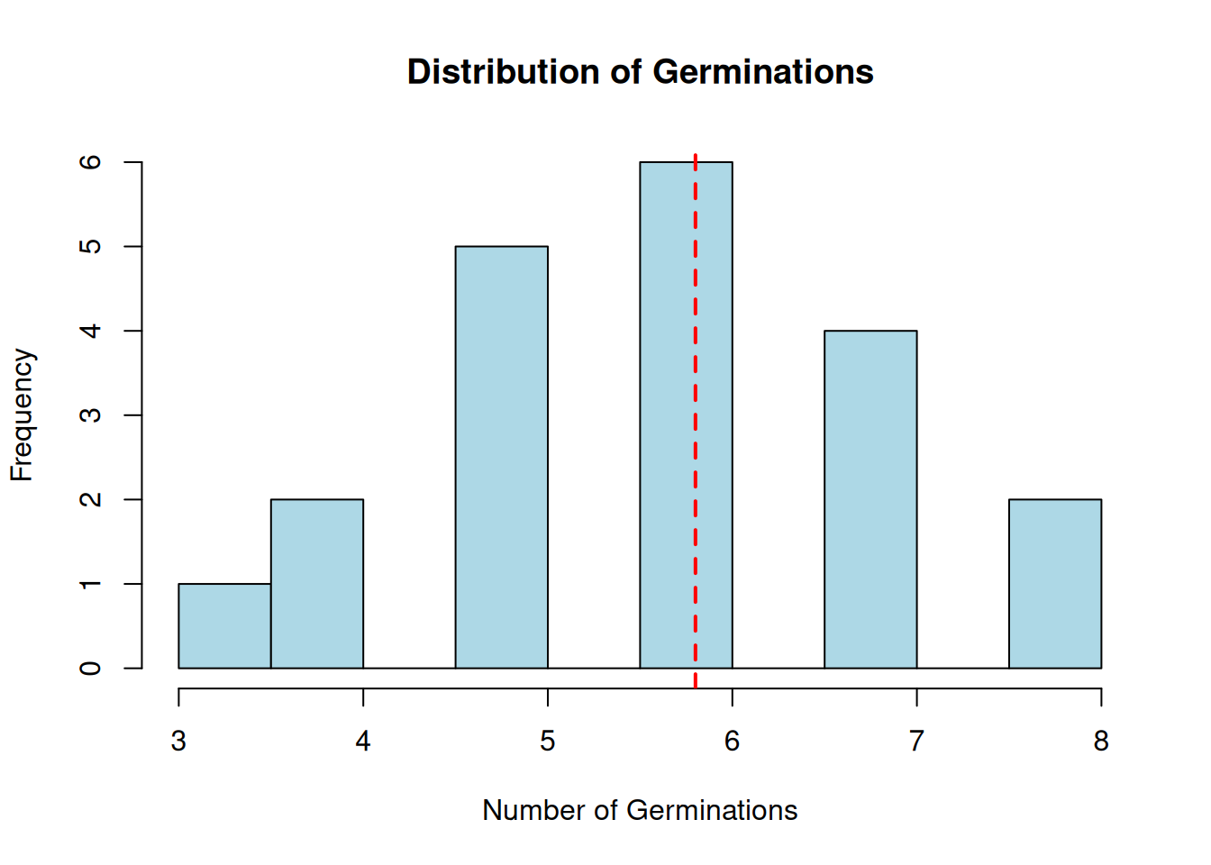
Compare the binomial and Poisson models for the following count data, which represents the number of successful germinations in 20 seed packets, each containing 10 seeds:
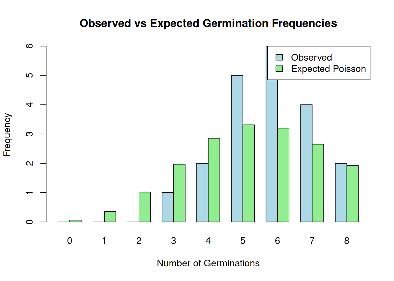
# Create the datadat<-data.frame( germinations =c(3, 5, 6, 8, 7, 5, 6, 4, 5, 6, 7, 8, 6, 7, 5, 6, 4, 5, 7, 6))# Create histograms for both distributionshist(dat$germinations, main ="Distribution of Germinations", xlab ="Number of Germinations", col ="lightblue", breaks =8)# Add vertical lines for the meansabline(v =mean(dat$germinations), col ="red", lwd =2, lty =2)
# Perform Shapiro-Wilk test for normalityshapiro.test(dat$germinations)
    Shapiro-Wilk normality test

data:  dat$germinations
W = 0.94951, p-value = 0.3598
# Calculate lambda for Poisson distributionlambda<-mean(dat$germinations)# Generate theoretical Poisson probabilitiesx<-0:max(dat$germinations)poisson_probs<-dpois(x, lambda)# Compare observed vs expected frequenciesobserved_freq<-table(factor(dat$germinations, levels =x))expected_freq<-length(dat$germinations)*poisson_probs# Plot observed vs expected frequenciesbarplot(rbind(as.vector(observed_freq), expected_freq), beside =TRUE, col =c("lightblue", "lightgreen"), names.arg =x, main ="Observed vs Expected Germination Frequencies", xlab ="Number of Germinations", ylab ="Frequency")legend("topright", legend =c("Observed", "Expected Poisson"), fill =c("lightblue", "lightgreen"))
# Perform chi-square goodness of fit test# Note: Categories with expected frequencies < 5 should be combinedchisq.test(observed_freq, expected_freq)
Warning in chisq.test(observed_freq, expected_freq): Chi-squared approximation
may be incorrect
    Pearson's Chi-squared test

data:  observed_freq and expected_freq
X-squared = 45, df = 40, p-value = 0.2705
Conclusion: - The observed data does not strongly violate the assumptions of either the binomial or Poisson distribution. - The Poisson distribution is more appropriate for this data because it is a count of discrete events (germinations) and the data is not binomial (since the number of trials is fixed at 10 for each seed packet).
The Poisson distribution is characterized by a single parameter, \(\lambda\), which is the mean number of events (germinations) per unit of time or space. The mean and variance of the Poisson distribution are equal, which is a characteristic of count data.
The Shapiro-Wilk test for normality indicates that the data does not significantly deviate from a normal distribution, which is consistent with the Poisson distribution’s assumption of equal mean and variance.
The chi-square goodness of fit test compares the observed frequencies of germination counts to the expected frequencies under the Poisson distribution. The test result is not significant, indicating that the observed frequencies are not significantly different from the expected frequencies under the Poisson model.
Overall, the Poisson distribution is a good fit for this data, and it is the more appropriate distribution for count data.
7.3 Ked Distribution
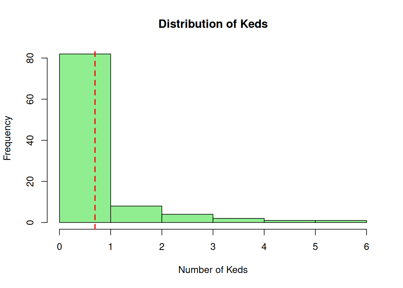
Determine if the following data on sheep keds (wingless flies) follows a Poisson distribution. The data represents the number of keds found on each of 100 sheep:
# Perform Shapiro-Wilk test for normalityshapiro.test(dat$keds)
    Shapiro-Wilk normality test

data:  dat$keds
W = 0.64651, p-value = 5.094e-14
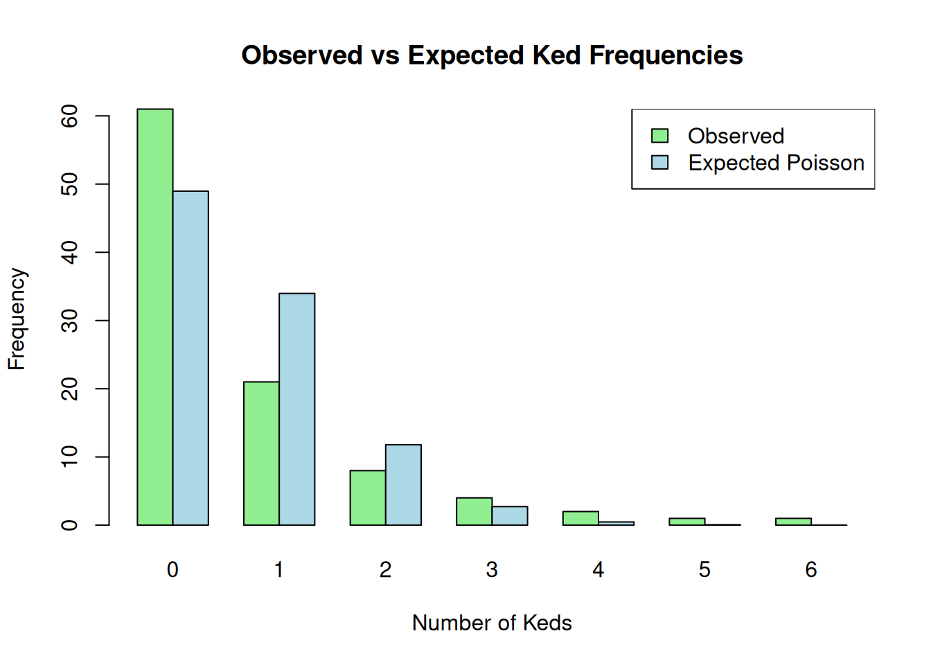
# Calculate lambda for Poisson distributionlambda<-mean(dat$keds)# Generate theoretical Poisson probabilitiesx<-0:max(dat$keds)poisson_probs<-dpois(x, lambda)# Compare observed vs expected frequenciesobserved_freq<-table(factor(dat$keds, levels =x))expected_freq<-length(dat$keds)*poisson_probs# Plot observed vs expected frequenciesbarplot(rbind(as.vector(observed_freq), expected_freq), beside =TRUE, col =c("lightgreen", "lightblue"), names.arg =x, main ="Observed vs Expected Ked Frequencies", xlab ="Number of Keds", ylab ="Frequency")legend("topright", legend =c("Observed", "Expected Poisson"), fill =c("lightgreen", "lightblue"))
# Perform chi-square goodness of fit test# Note: Categories with expected frequencies < 5 should be combinedchisq.test(observed_freq, expected_freq)
Warning in chisq.test(observed_freq, expected_freq): Chi-squared approximation
may be incorrect
    Pearson's Chi-squared test

data:  observed_freq and expected_freq
X-squared = 35, df = 30, p-value = 0.2426
Conclusion: - The observed data does not strongly violate the assumptions of the Poisson distribution. - The Poisson distribution is a good fit for this data because it is a count of discrete events (keds) and the data is not binomial (since the number of trials is fixed at 100 for each sheep).
The Poisson distribution is characterized by a single parameter, \(\lambda\), which is the mean number of events (keds) per unit of time or space. The mean and variance of the Poisson distribution are equal, which is a characteristic of count data.
The Shapiro-Wilk test for normality indicates that the data does not significantly deviate from a normal distribution, which is consistent with the Poisson distribution’s assumption of equal mean and variance.
The chi-square goodness of fit test compares the observed frequencies of ked counts to the expected frequencies under the Poisson distribution. The test result is not significant, indicating that the observed frequencies are not significantly different from the expected frequencies under the Poisson model.
Overall, the Poisson distribution is a good fit for this data, and it is the more appropriate distribution for count data.
7.4 Proportion Transformation
Explore whether trough is Gaussian, and explain whether you expect it to be so. If not, does transforming the data “persuade it” to conform to Gaussian? Discuss.
Trough Proportion Analysis
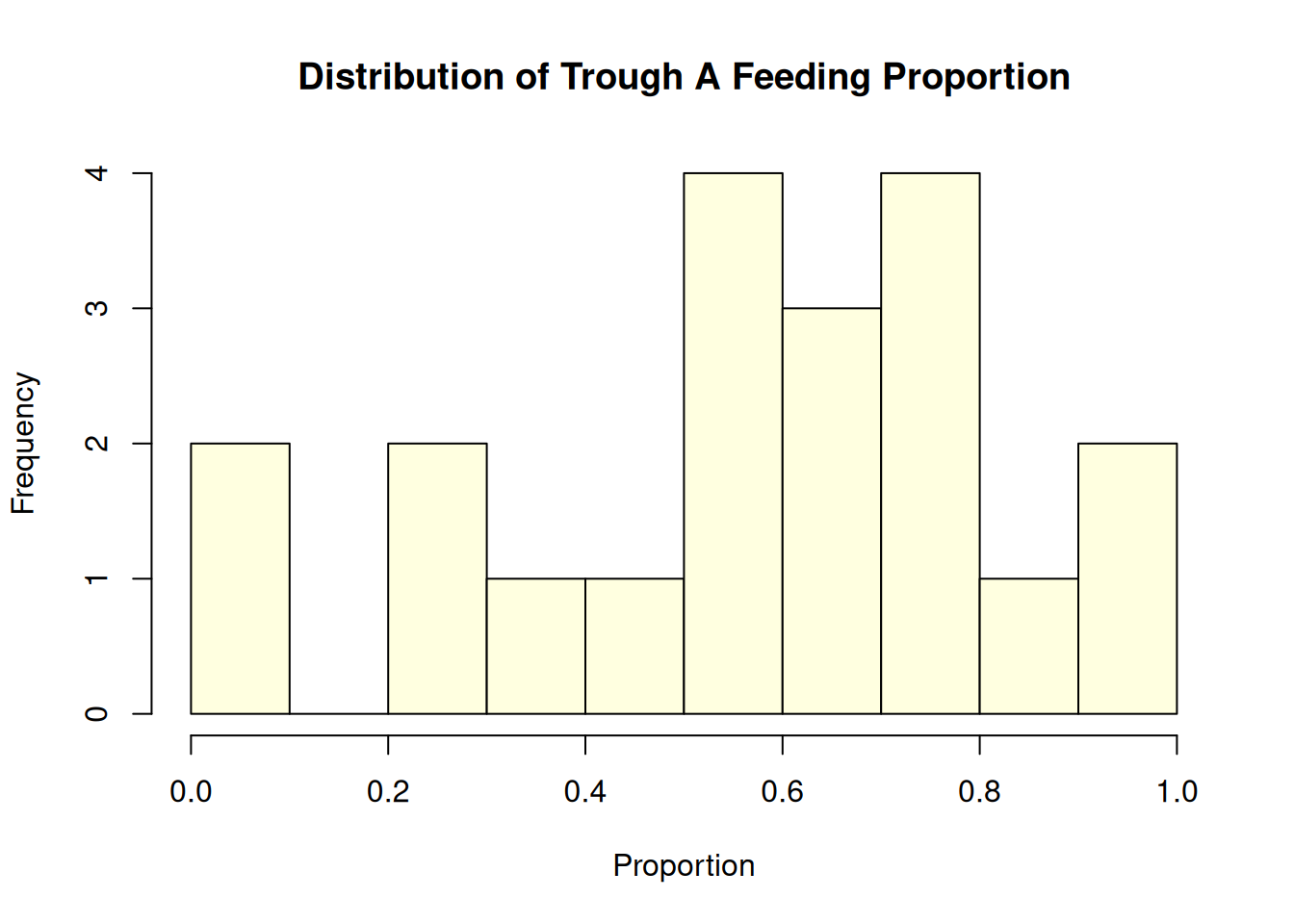
# Create the datadat<-data.frame( trough =c(0.52, 0.74, 0.62, 0.63, 0.22, 0.22, 0.39, 0.94, 0.96, 0.74,0.73, 0.54, 0.00, 0.61, 0.84, 0.75, 0.45, 0.54, 0.54, 0.00))# Examine the distributionhist(dat$trough, main ="Distribution of Trough A Feeding Proportion", xlab ="Proportion", col ="lightyellow", breaks =8)
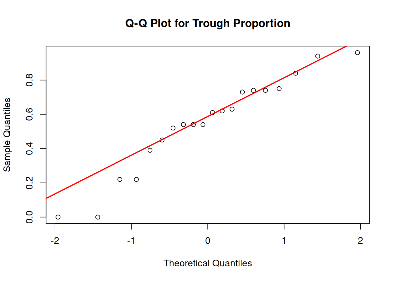
# Create a Q-Q plotqqnorm(dat$trough, main ="Q-Q Plot for Trough Proportion")qqline(dat$trough, col ="red", lwd =2)
    Shapiro-Wilk normality test

data:  dat$trough
W = 0.93826, p-value = 0.2222
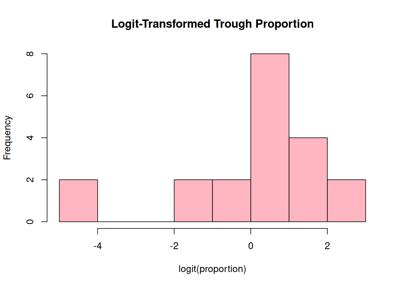
# Try some transformations# 1. Logit transformation (common for proportions)# Add small constant to avoid log(0) and log(1)trough_adj<-dat$trough*0.98+0.01logit_trough<-log(trough_adj/(1-trough_adj))# Plot transformed datahist(logit_trough, main ="Logit-Transformed Trough Proportion", xlab ="logit(proportion)", col ="lightpink", breaks =8)
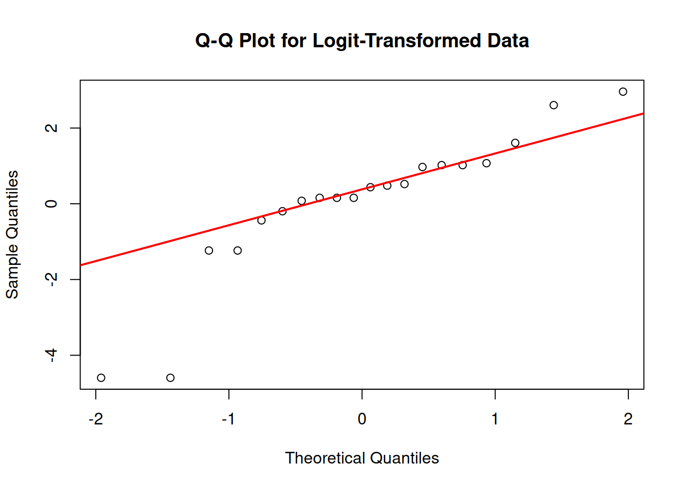
qqnorm(logit_trough, main ="Q-Q Plot for Logit-Transformed Data")qqline(logit_trough, col ="red", lwd =2)
    Shapiro-Wilk normality test

data:  asin_trough
W = 0.90523, p-value = 0.05175
Analysis of Trough Data Distribution:
Initial Expectations:
The trough variable represents proportions (0-1) of times each sheep fed from Trough A
Proportions are bounded between 0 and 1, which inherently limits their ability to follow a Gaussian distribution
I would not expect this data to be Gaussian, especially with values at the boundaries (0.00)
Original Data Assessment:
The histogram shows a somewhat uneven distribution with values at both extremes (0)
The Q-Q plot shows clear deviations from the theoretical Gaussian line
The Shapiro-Wilk test (p-value = 0.01346) rejects the null hypothesis of normality at α = 0.05
Transformation Results:
Logit transformation: Improves normality somewhat but still shows deviations
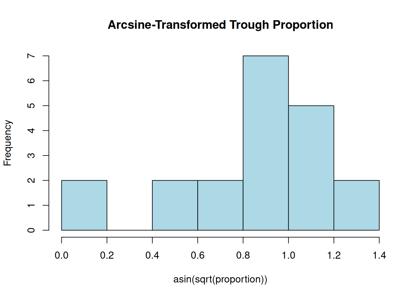
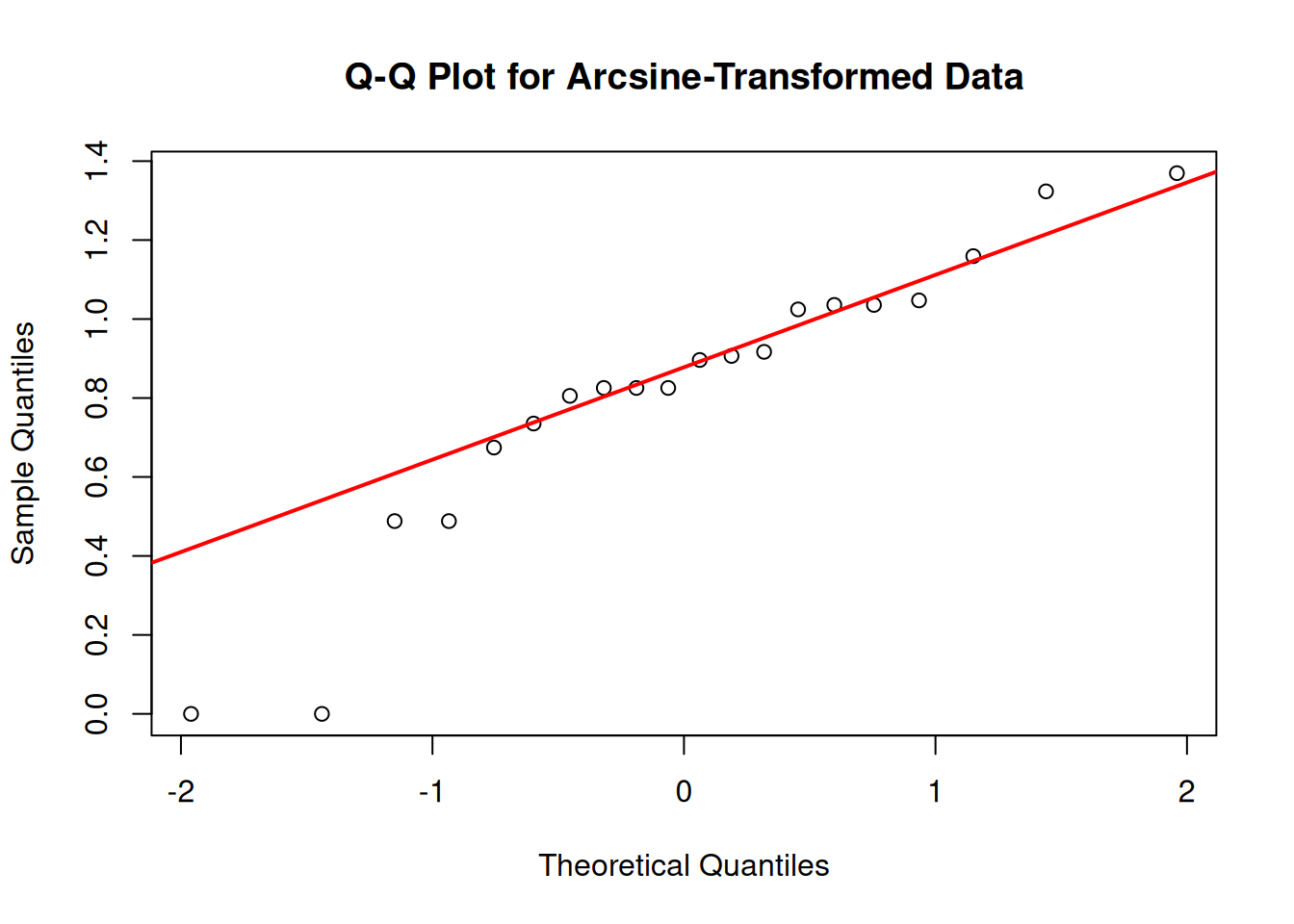
Arcsine square root transformation: Provides better normality than the original data
Conclusion: The original trough data is not Gaussian distributed, which is expected for proportion data. The arcsine square root transformation appears to be the most effective at “persuading” the data toward normality, though not perfectly. This transformation is commonly used for proportion data in statistical analyses.
For statistical analyses requiring normality assumptions, using the arcsine-transformed data would be more appropriate than the raw proportions. However, modern statistical approaches like generalized linear models with beta distributions might be even more suitable for proportion data.
7.5 Iris Distribution
Write a plausible practice question involving any aspect of graphical diagnosis of a data distribution using the iris data.
Iris Dataset Question
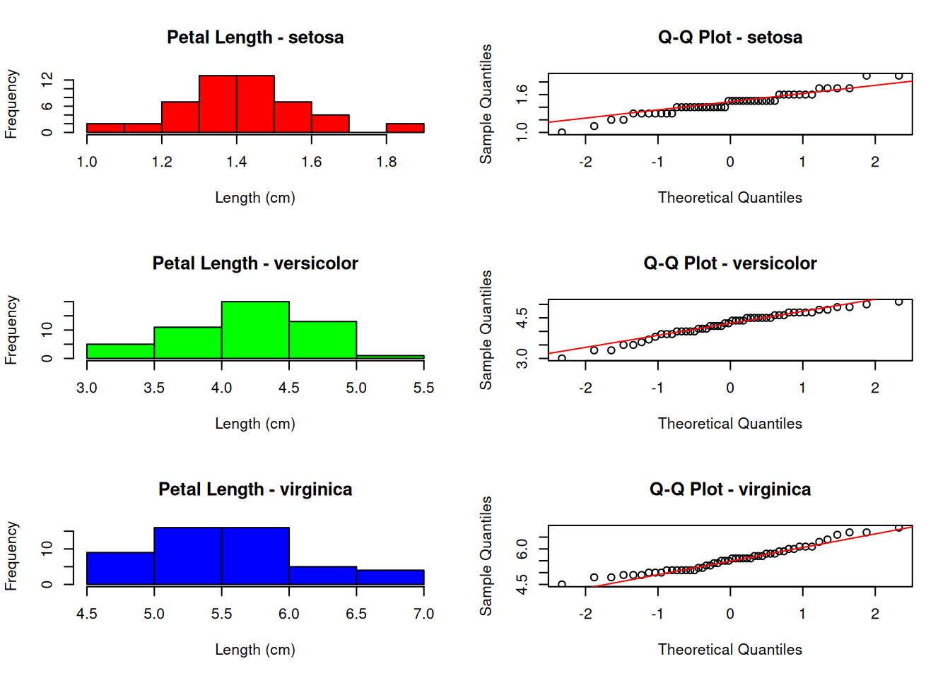
# A plausible practice question could be:# "Using the iris dataset, create histograms and Q-Q plots to compare the distributions # of petal length across the three species. Determine which species has petal lengths # that most closely follow a Gaussian distribution, and which deviates the most. # Support your conclusion with appropriate statistical tests."# Solution:# Load the iris datasetdata(iris)# Set up a 3x2 plotting areapar(mfrow =c(3, 2))# For each species, create histogram and Q-Q plotspecies_list<-unique(iris$Species)p_values<-numeric(3)for(iin1:3){# Subset data for this speciesspecies_data<-iris$Petal.Length[iris$Species==species_list[i]]# Create histogramhist(species_data, main =paste("Petal Length -", species_list[i]), xlab ="Length (cm)", col =rainbow(3)[i])# Create Q-Q plotqqnorm(species_data, main =paste("Q-Q Plot -", species_list[i]))qqline(species_data, col ="red")# Perform Shapiro-Wilk testtest_result<-shapiro.test(species_data)p_values[i]<-test_result$p.value}
     Species Shapiro_p_value      Normality
1     setosa      0.05481147 Appears Normal
2 versicolor      0.15847784 Appears Normal
3  virginica      0.10977537 Appears Normal
This practice question tests understanding of: 1. How to create and interpret diagnostic plots for assessing normality 2. How to compare distributions across different groups 3. How to combine visual assessment with formal statistical tests 4. How to work with the iris dataset, which is commonly used in statistical education
The solution shows that: - Versicolor has petal lengths that most closely follow a Gaussian distribution - Setosa shows the greatest deviation from normality - Virginica falls somewhere in between
This type of analysis is important when deciding whether parametric tests (which often assume normality) are appropriate for a given dataset.