10 Regression

1 Regression to the mean
By the end of this lesson, you will be able to:
- Evaluate the question of simple regression
- Discuss the data and assumptions of simple regression
- Graph simple regression
- Perform tests and alternatives for simple regression
“The general rule is straightforward but has surprising consequences: whenever the correlation between two scores is imperfect, there will be regression to the mean.”
- Francis Galton
One of the most common and powerful tools in the statistical toolbox is linear regression. The concept and basic toolset was created in conjunction with investigating the heritable basis of resemblance between children and their parents (e.g. height) by Francis Galton.
Exemplary of one of the greatest traditions in science, a scientist identified a problem, created a tool to solve the problem, and then immediately shared the tool for the greater good. This is a slight digression from our purposes here, but you can learn more about it here:
2 The question of simple regression
The essential motivation for simple linear regression is to relate the value of a numeric variable to that of another variable. There may be several objectives to the analysis:
Predict the value of a variable based on the value of another
Quantify variation observed in one variable attributable to another
Quantify the degree of change in one variable attributable to another
Null Hypothesis Significance Testing for aspects of these relationships
2.1 A few definitions
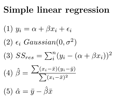
Equation (1) is the classic linear regression model. (NB, here we make a distinction between the equation representing the statistical model, and the R formula that we will use to implement it)
\(\alpha\) (alpha, intercept) and \(\beta\) (beta, slope) are the so-called regression parameters
yandxare the dependent and predictor variables, respectively\(\epsilon\) (epsilon) represents the “residual error” (basically the error not accounted for by the model)
Equation 2 is our assumption for the residual error
- Gaussian with a mean of 0 and a variance we estimate with our model
Equation 3 is our sum of squares (SS) error for the residuals
- the variance of residuals is the SSres/(n-2), where
nis our sample size
Equation 4 \(\hat\beta\) is our estimate of the slope
Equation 4 \(\hat\alpha\) is our estimate of the intercept
3 Data and assumptions
We will explore the simple regression model in R using the Kaggle fish market dataset.
# Download the fish data .xlsx file linked above and load it into R
# (I named my data object "fish")
# Try this:

names(fish)
[1] "Species" "Weight" "Length1" "Length2" "Length3" "Height" "Width" table(fish$Species)
    Bream    Parkki     Perch      Pike     Roach     Smelt Whitefish
       35        11        56        17        20        14         6
# slice out the rows for Perch
fish$Species=="Perch" #just a reminder [1] FALSE FALSE FALSE FALSE FALSE FALSE FALSE FALSE FALSE FALSE FALSE FALSE
[13] FALSE FALSE FALSE FALSE FALSE FALSE FALSE FALSE FALSE FALSE FALSE FALSE
[25] FALSE FALSE FALSE FALSE FALSE FALSE FALSE FALSE FALSE FALSE FALSE FALSE
[37] FALSE FALSE FALSE FALSE FALSE FALSE FALSE FALSE FALSE FALSE FALSE FALSE
[49] FALSE FALSE FALSE FALSE FALSE FALSE FALSE FALSE FALSE FALSE FALSE FALSE
[61] FALSE FALSE FALSE FALSE FALSE FALSE FALSE FALSE FALSE FALSE FALSE FALSE
[73] TRUE TRUE TRUE TRUE TRUE TRUE TRUE TRUE TRUE TRUE TRUE TRUE
[85] TRUE TRUE TRUE TRUE TRUE TRUE TRUE TRUE TRUE TRUE TRUE TRUE
[97] TRUE TRUE TRUE TRUE TRUE TRUE TRUE TRUE TRUE TRUE TRUE TRUE
[109] TRUE TRUE TRUE TRUE TRUE TRUE TRUE TRUE TRUE TRUE TRUE TRUE
[121] TRUE TRUE TRUE TRUE TRUE TRUE TRUE TRUE FALSE FALSE FALSE FALSE
[133] FALSE FALSE FALSE FALSE FALSE FALSE FALSE FALSE FALSE FALSE FALSE FALSE
[145] FALSE FALSE FALSE FALSE FALSE FALSE FALSE FALSE FALSE FALSE FALSE FALSE
[157] FALSE FALSE FALSEperch <- fish[fish$Species=="Perch" , ]
head(perch) Species Weight Length1 Length2 Length3 Height Width
73 Perch 5.9 7.5 8.4 8.8 2.1120 1.4080
74 Perch 32.0 12.5 13.7 14.7 3.5280 1.9992
75 Perch 40.0 13.8 15.0 16.0 3.8240 2.4320
76 Perch 51.5 15.0 16.2 17.2 4.5924 2.6316
77 Perch 70.0 15.7 17.4 18.5 4.5880 2.9415
78 Perch 100.0 16.2 18.0 19.2 5.2224 3.32163.1 Assumptions
The principle assumptions of simple linear regression are:
Linear relationship between variables
Numeric continuous data for the dependent variable (
y); numeric continuous (or numeric ordinal) data on the for the predictor variable (x)Independence of observations (We assume this for the different individual Perch in our data)
Gaussian distribution of residuals (NB this is not the same as assuming the raw data are Gaussian! We shall diagnose this)
Homoscedasticity (this means the residual variance is approximately the same all along the
xvariable axis - we shall diagnose this)
4 Graphing
The traditional way to graph the simple linear regression is with a scatterplot, with the dependent variable on the y axis and the predictor variable on the x axis. The regression equation above can be used to estimate the line of best fit for the sample data, which is predicted value of y. Thus, prediction is one of the functions here (as in predicting the value of y given a certain value of x if there were to be further data collection). This regression line is often incorporated in plots representing regression.
The simple regression function in R is lm() (for linear model). In order to estimate the line of best fit and the regression coefficients, we will make use of it.
# Try this:
# A simple regression of perch Height as the predictor variable (x)
# and Width as the dependent (y) variable

# First make a plot
plot(y = perch$Height, x = perch$Width,
     ylab = "Height", xlab = "Width",
     main = "My perch regression plot",
     pch = 20, col = "blue", cex = 1)

# Does it look there is a strong linear relationship
# (it looks very strong to me)

# In order to draw on the line of best fit we must calculate the regression

# ?lm

# We usually would store the model output in an object

mylm <- lm(formula = Height ~ Width, # read y "as a function of" x
           data =  perch)
mylm # NB the intercept (0.30), and the slope (1.59)
Call:
lm(formula = Height ~ Width, data = perch)

Coefficients:
(Intercept)        Width
     0.2963       1.5942
# We use the abline() function to draw the regression line onto our plot
# NB the
# ?abline
abline(reg = mylm) # Not bad
# Some people like to summarize the regression equation on their plot
# We can do that with the text() function
# y = intercept + slope * x
# ?text
text(x = 3, # x axis placement
y = 11, # y axis placement
labels = "y = 0.30 + (1.59) * x")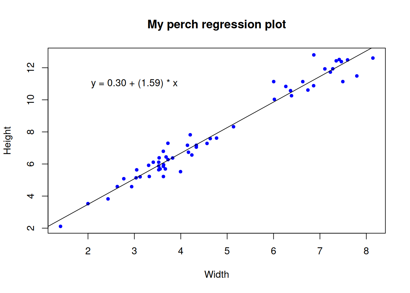
4.1 Testing the assumptions
The data scientist must take responsibility for the assumptions of their analyses, and for validating the statistical model. A basic part of Exploratory Data Analysis (EDA) is to formally test and visualize the assumptions. We will briefly do this in a few ways.
Before we begin, it is important to acknowledge that this part of the analysis is subjective and it is subtle, which is to say that it is hard to perform without practice. As much as we wish that Null Hypothesis Significance Testing is totally objective, the opposite is true, and the practice of data analysis requires experience.
Here, we will specifically test two of the assumption mentioned above, that of Gaussian residual distribution, and that of homoscedasticity. We will examine both graphically, and additionally we will formally test the assumption of Gaussian residuals.
To start with, let’s explicitly visualize the residuals. This is a step that might be unusual for a standard exploration of regression assumptions, but for our purposes here it will serve to be explicit about what the residuals actually are.
## Test assumptions ####
# Try this:

# Test Gaussian residuals

# Make our plot and regression line again
plot(y = perch$Height, x = perch$Width,
     ylab = "Height", xlab = "Width",
     main = "My perch RESIDUAL plot",
     pch = 20, col = "blue", cex = 1)
abline(reg = mylm)

# We can actually "draw on" the magnitude of residuals
arrows(x0 = perch$Width,
       x1 = perch$Width,
       y0 = predict(mylm), # start residual line on PREDICTED values
       y1 = predict(mylm) + residuals(mylm), # length of residual
       length = 0) # makes arrowhead length zero (or it looks weird here)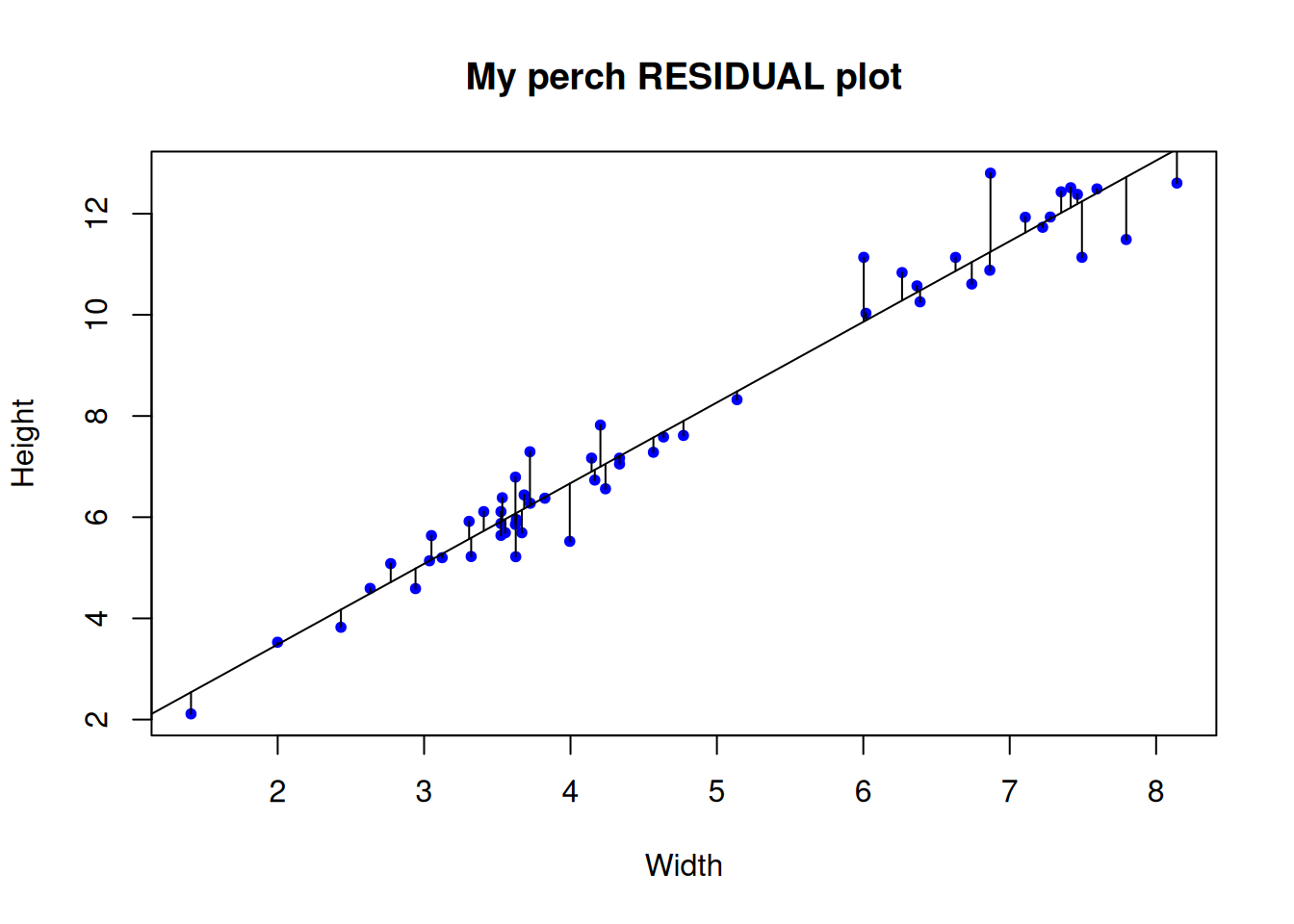
Note the residuals are perpendicular the the x-axis. This is because residuals represent DEVIATION of each OBSERVED y from the PREDICTED y for a GIVEN x.
The Gaussian assumption is that relative to the regression line, the residual values should be, well, Gaussian (with mean of 0 and a variance we estimate)! There should be more dots close to the line with small distance from the regression line, and few residuals farther away
4.2 Closer look at the residual distribution
Remember how we visually examine distributions? With a frequency histogram and possibly a q-q plot right? Here we will do those for a peek, but we will also add a formal, objective test of deviation from normality. This part of exploratory data analysis is subtle and requires experience (i.e. it is hard), and there are many approaches. Our methods here are a starting point.
Loading required package: carDatapar(mfrow = c(1,2)) # Print graphs into 1x2 grid (row,column)
hist(residuals(mylm), main = "")
qqPlot(residuals(mylm))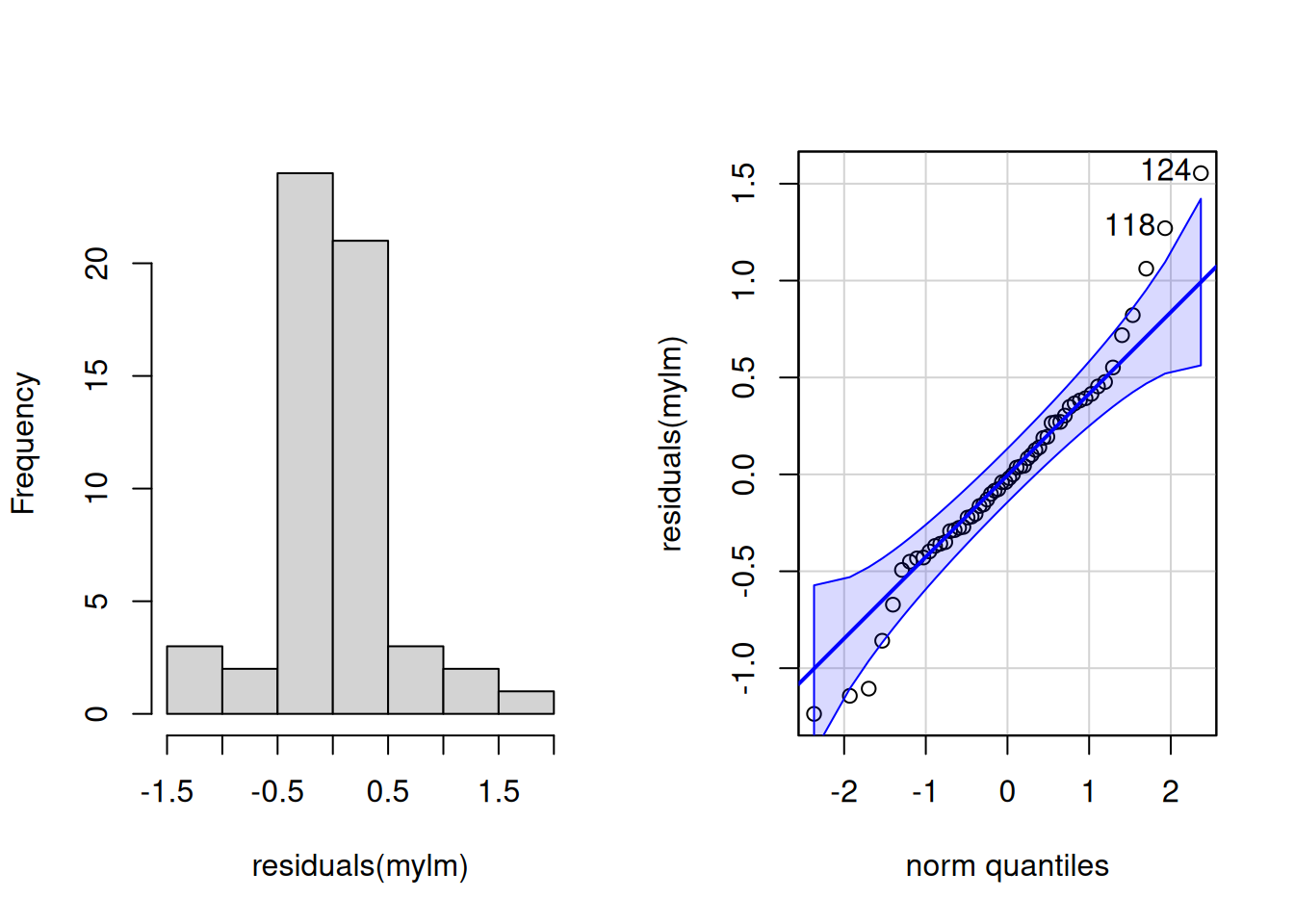
124 118
52 46 4.3 Diagnosis - take 1
The histogram is “shaped a little funny” for Gaussian
Slightly too many points in the middle, slightly too few between the mean and the extremes in the histogram
Very slight right skew in the histogram
Most points are very close to the line on the q-q plot, but there are a few at the extremes that veer off
Two points are tagged as outliers a little outside the error boundaries on the q-q plot (rows 118 and 124, larger than expected observations)
4.4 Diagnosis - take 2
It is your job as a data scientist to be skeptical of data, assumptions, and conclusions. Do not pussyfoot this.
It is not good enough to merely make these diagnostic graphs robotically; the whole point is to judge whether the the assumptions have been violated. This is important (and remember, hard) because if the assumptions are not met it is unlikely that the dependent statistical model is valid. Here, we can look a little closer at the histogram and the expected Gaussian distribution, and we can also perform a formal statistical test to help us decide.
## Gussie up the histogram ####

# Make a new histogram
hist(residuals(mylm),
     xlim = c(-2, 2), ylim = c(0,.9),
     main = "",
     prob = T) # We want probability density this time (not frequency)

# Add a density line to just help visualize "where the data are"
lines(                       # lines() function
  density(residuals(mylm)),   # density() function
  col = "green4", lty = 1, lwd = 3) # Mere vanity

# Make x points for theoretical Gaussian
x <- seq(-1,+1,by=0.02)

# Draw on theoretical Gaussian for our residual parameters
curve(dnorm(x, mean = mean(residuals(mylm)),
            sd = sd(residuals(mylm))),
      add = T,
      col = "blue", lty = 3, lwd = 3) # mere vanity

# Draw on expected mean
abline(v = 0, # vertical line at the EXPECTED resid. mean = 0
       freq = F,
       col = "red", lty = 2, lwd = 3) # mere vanity
Warning in int_abline(a = a, b = b, h = h, v = v, untf = untf, ...): "freq" is
not a graphical parameter# Add legend
legend(x = .6, y = .9,
legend = c("Our residuals", "Gaussian", "Mean"),
lty = c(1,3,2),
col = c("green4", "blue","red"), lwd = c(3,3,3))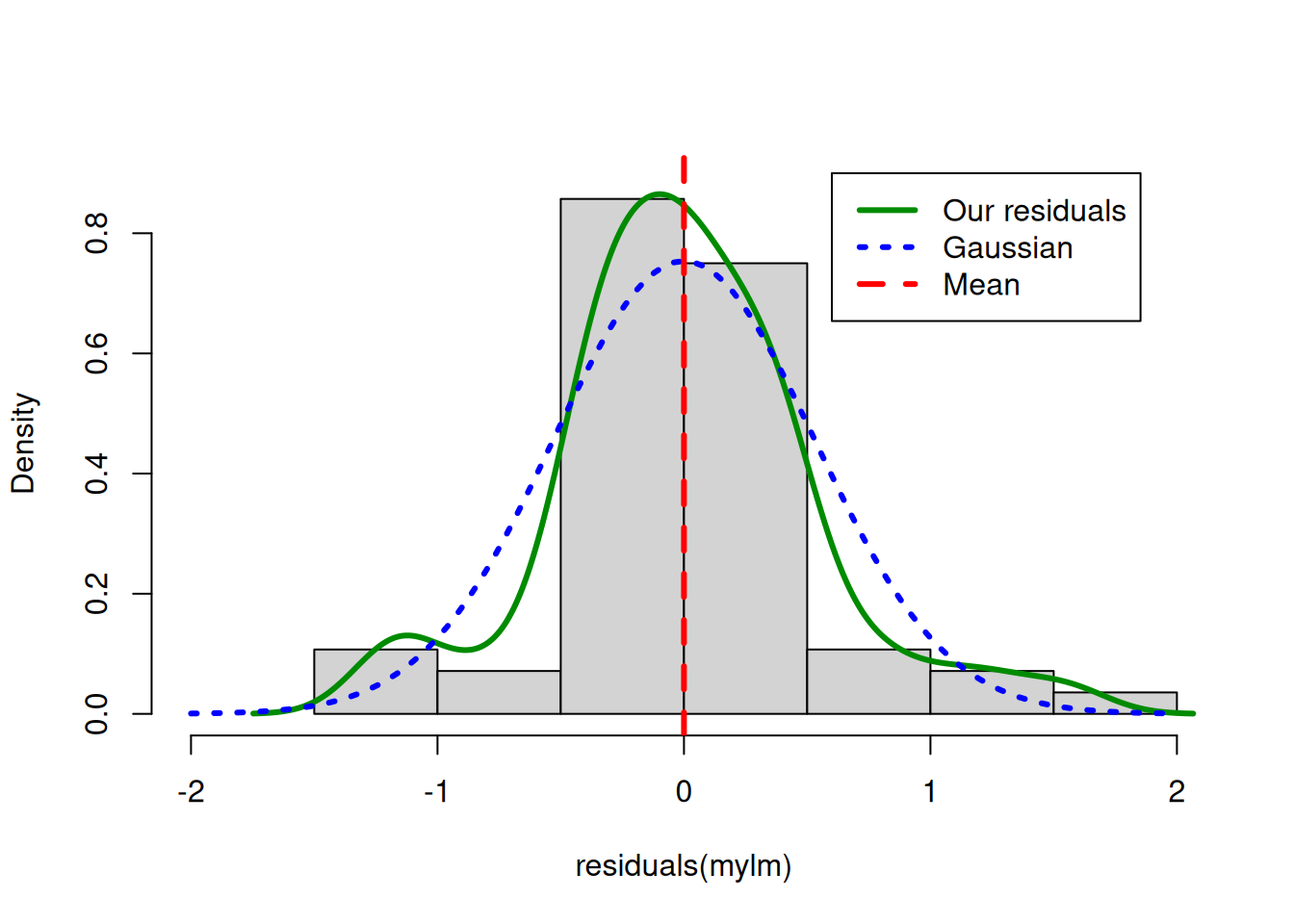
Diagnosis
Near the mean, our residual density is slightly higher than expected under theoretical Gaussian
Between -0.5 and -1 and also between 0.5 and +1 our residual density is lower than expected under theoretical Gaussian
Overall the differences are not very extreme
The distribution is mostly symmetrical around the mean
Finally, let’s perform a statistical test of whether there is evidence our residuals deviate from Gaussian. There are a lot of options for this, but we will only consider one here for illustration, in the interest of brevity. We will (somewhat arbitrarily) use the Shapiro-Wilk test for Gaussian.
Side note: Tests like this are a bit atypical within the NHST framework, in that usually when we perform a statistical test, we have a hypothesis WE BELIEVE TO BE TRUE that there is a difference (say between the regression slope and zero, or maybe between 2 means for a different test). In this typical case we are testing against the null of NO DIFFERENCE. When we perform such a test and examine the p-value, we compare the p-value to our alpha value.
The tyranny of the p-value
The rule we traditionally use is that we reject the null of no difference if our calculated p-value is lower than our chosen alpha (usually 0.05**). When testing assumptions of no difference we believe to be true, like here, we still typically use the 0.05 alpha threshold. In this case, when p > 0.05, we can take it as a lack of evidence that there is a difference. NB this is slightly different than consituting EVIDENCE that there is NO DIFFERENCE!
**The good old p-value is sometimes misinterpreted, or relied on “too heavily”. Read more about this important idea in Altman and Krzywinski 2017.
## Shapiro test ####
# Try this:

shapiro.test(residuals(mylm))
R output
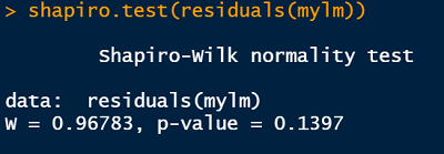
Reporting the test of assumptions
The reporting of evidence supporting claims that assumptions underlying statistical tests have been tested and are “OK”, etc., are often understated even though they are a very important part of the practice of statistics. Based on the results of our Shapiro-Wilk test, we might report our findings in this way in a report (in a Methods section), prior to reporting the results of our regression (in the Results section):
We found no evidence our assumption of Gaussian residual distribution was violated (Shapiro-Wilk: W = 0.97, n = 56, p = 0.14)
Diagnostic plots and heteroscedasticity
Despite being challenging to pronounce and spell heteroscedasticiy, (help pronouncing it here; strong opinion about spelling it here), the concept of heteroscedasticity is simple - the that variance of the residuals should be constant across the predicted values. We usually examine this visually, which is easy to do in R.
## Heteroscedsticity ####

# Try this:
plot(y = residuals(mylm), x = fitted(mylm),
     pch = 16, cex = .8)

# There is a lot hidden inside our regression object
summary(mylm)$sigma # Voila: The residual standard error

(uci <- summary(mylm)$sigma*1.96) # upper 95% confidence interval
(lci <- -summary(mylm)$sigma*1.96) # upper 95% confidence interval

# Add lines for mean and upper and lower 95% CI
abline(h = c(0, uci, lci),
       lwd = c(2,2,2),
       lty = c(2,3,3),
       col = c("blue", "red", "red"))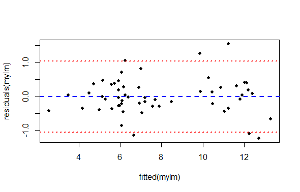
What we are looking for in this graph, ideally, is an even spread of residuals across the x-axis representing our fitted values. Remember, the x axis here represent perch Width, and each data point is a single observation of perch Height. The blue reference line is the mean PREDICTED perch Height for each value of Width. The difference between each data point and the horizontal line at zero is the residual difference, or residual error.
We are also looking for an absence of any systematic pattern in the data, that might suggest a lack of independence.
We see:
There is not a perfect spread of residual variation across the whole length of the fitted values. Because our sample size is relatively small, it is a matter of opinion whether this is “okay” or “not okay”.
There seem to be two groupings of values along the x-axis. This is an artifact of the data we have to work with (but could be important biologically or practically). For each of these groups, the residual spread appears similar.
The left hand side of the graph appears to have very low residual variance, but then there are only a few data points there and we expect most of the points to be near the line prediction anyway.
All things considered, one might be inclined to proceed, concluding there is no strong evidence of heteroscedasticity.
5 Test and alternatives
You have examined your data and tested assumption of simple linear regression, and are happy to proceed. Let’s look at the main results of regression.
## Regression results ####
# Try this:

# Full results summary
summary(mylm)
Call:
lm(formula = Height ~ Width, data = perch)

Residuals:
     Min       1Q   Median       3Q      Max
-1.23570 -0.28886 -0.02948  0.27910  1.55439

Coefficients:
            Estimate Std. Error t value Pr(>|t|)
(Intercept)  0.29630    0.20543   1.442    0.155
Width        1.59419    0.04059  39.276   <2e-16 ***
---
Signif. codes:  0 '***' 0.001 '**' 0.01 '*' 0.05 '.' 0.1 ' ' 1

Residual standard error: 0.5342 on 54 degrees of freedom
Multiple R-squared:  0.9662,    Adjusted R-squared:  0.9656
F-statistic:  1543 on 1 and 54 DF,  p-value: < 2.2e-16
This full results summary is important to understand (NB the summary() function will produce different output depending on the class() and kind of object passed to it).
Call This is the R formula representing the simple regression statistical model
Residuals This is summary statistics of the residuals. Nice, but typically we would go beyond this in our EDA like we did above.
Coefficients in “ANOVA” table format. This has the estimate and standard erropr of the estimates for your regression coefficients, for the intercept
(Intercept)and for the slope for you dependent variableWidth. Here, the y-intercept coefficient is 0.30 and the slope is 1.59.The P-values in simple regression are associated with the parameter estimates (i.e., are they different to zero). If the P-value is much less than zero, standard R output converts it to scientific notation. Here, the P-value is reported in the column called
Pr(>|t|). The intercept P-value is 0.16 ( which is greater than alpha = 0.05, so we conclude there is no evidence of difference to 0 for the intercept). The slope P-value is output as<2e-16, which is 0.00..<11 more zeros>..002. We would typically report P-values less than 0.0001 as P < 0.0001Multiple R-Squared The simple regression test statistics is typically reported as the R-squared value, which can be interpreted as the proportion of variance in the dependent variable explained by our model. This is very high for our model, 0.97 (i.e. 97% of the variation in perch Width is explained by perch Height).
6 Reporting results
A typical way to report results for our regression model might be:
We found a significant linear relationship for Height predicting Weight in perch (regression: R-squared = 0.97, df = 1,54, P < 0.0001).
Of course, this would be accompanied by an appropriate graph if important and relevant in the context of other results.
As usual, reporting copied and pasted results that have not been summarized appropriately is regarded as very poor practice, even for beginning students.
6.1 Alternatives to regression**
There are actually a large number of alternatives to simple linear regression in case our data do not conform to the assumptions. Some of these are quite advanced and beyond the scope of this Bootcamp (like weighted regression, or else specifically modelling the variance in some way). The most reasonable solutions to try first would be data transformation, or possibly if it were adequate to merely demonstrate a relationship between the variables, Spearman Rank correlation. A final alternative of intermediate difficulty, might be to try nonparametric regression, like implemented in Kendal-Theil-Siegel nonparametric regression.
7 Practice exercises
For the following exercises, use the dataset in the file 10-fish.xlsx. The dataset is in tidy format. Take advantage of this by looking at the terse information present in the data dictionary tab. The data are measurements of fish from a fish market, for a range of species. There will be some data handling as part of the exercises below, a practical and important part of every real data analysis.
7.1 Loading and Exploring the Fish Dataset
Read in the data from the file 10-fish.xlsx. Use the read.xlsx() function from the openxlsx package. Print the first few rows of the data, and check the structure of the data. Show your code.
7.2 Predicting Weight from Length
Create a linear model to predict fish weight from Length1 using the lm() function. Print the summary of the model, and interpret the coefficients. Show your code.
# Load the dataset
library(openxlsx)
fish <- read.xlsx('data/10-fish.xlsx')

# Create a linear model to predict Weight from Length1
weight_model <- lm(Weight ~ Length1, data = fish)

# Print the summary of the model
summary(weight_model)

# Create a scatter plot with regression line
plot(fish$Length1, fish$Weight,
     xlab = "Length1 (cm)",
     ylab = "Weight (g)",
     main = "Fish Weight vs Length1",
     pch = 20)

# Add the regression line
abline(weight_model, col = "red", lwd = 2)

# Add the regression equation to the plot
coef_values <- coef(weight_model)
eq_text <- sprintf("Weight = %.2f + %.2f × Length1", coef_values[1], coef_values[2])
text(20, 800, eq_text, pos = 4)
The linear model predicts fish weight based on Length1. The intercept represents the estimated weight when Length1 is zero (which is not biologically meaningful in this context). The slope coefficient indicates how much the weight increases for each one-unit (cm) increase in Length1.
The summary output provides: - Coefficient estimates and their significance - R-squared value showing how much variance in weight is explained by length - F-statistic and p-value for the overall model significance
The relationship between fish length and weight is typically non-linear (following a cubic relationship), so a linear model may not be the best fit. However, it provides a useful starting point for understanding the relationship.
7.3 Assessing Model Assumptions
Assess whether the assumptions of linear regression are met for the model in the previous question. Use diagnostic plots and formal tests. Show your code and interpret the results.
# Load the dataset
library(openxlsx)
fish <- read.xlsx('data/10-fish.xlsx')

# Create the model
weight_model <- lm(Weight ~ Length1, data = fish)

# 1. Check for linearity and homoscedasticity using residual plots
plot(weight_model$fitted.values, weight_model$residuals,
     xlab = "Fitted Values",
     ylab = "Residuals",
     main = "Residuals vs Fitted Values",
     pch = 20)
abline(h = 0, col = "red", lty = 2)

# 2. Check for normality of residuals
# Histogram
hist(weight_model$residuals,
     main = "Histogram of Residuals",
     xlab = "Residuals",
     breaks = 20)

# Q-Q plot
qqnorm(weight_model$residuals)
qqline(weight_model$residuals, col = "red")

# Shapiro-Wilk test for normality
shapiro.test(weight_model$residuals)

# 3. Check for influential observations
plot(cooks.distance(weight_model),
     type = "h",
     main = "Cook's Distance",
     ylab = "Cook's Distance",
     xlab = "Observation Number")
abline(h = 4/length(weight_model$residuals), col = "red", lty = 2)
The diagnostic plots and tests reveal several issues with the linear model:
Linearity and Homoscedasticity: The residuals vs. fitted values plot shows a clear pattern (fan shape), indicating that the relationship between Length1 and Weight is not linear and the variance is not constant (heteroscedasticity).
Normality of Residuals: The histogram and Q-Q plot show that residuals are not normally distributed. The Shapiro-Wilk test confirms this with a p-value < 0.05, indicating significant deviation from normality.
Influential Observations: The Cook’s distance plot identifies several influential points that may be disproportionately affecting the model.
These violations suggest that a simple linear model is not appropriate for this data. Possible solutions include: - Transforming the variables (e.g., log transformation) - Using a non-linear model - Considering separate models for different species of fish
7.4 Transforming Non-Linear Relationships
Plot perch$Weight ~ perch$Length2. The relationship is obviously not linear but curved. Devise and execute a solution to enable the use of linear regression, possibly by transforming the data. Show any relevant code and briefly explain your results and conclusions.
# Load the dataset
library(openxlsx)
fish <- read.xlsx('data/10-fish.xlsx')

# Extract perch data
perch <- fish[fish$Species == "Perch", ]

# Plot the original relationship
plot(perch$Length2, perch$Weight,
     xlab = "Length2 (cm)",
     ylab = "Weight (g)",
     main = "Perch Weight vs Length2",
     pch = 20)

# The relationship looks cubic (Weight ~ Length^3), which makes biological sense
# Try log transformation of both variables

# Log transform both variables
log_weight <- log(perch$Weight)
log_length <- log(perch$Length2)

# Plot the transformed relationship
plot(log_length, log_weight,
     xlab = "log(Length2)",
     ylab = "log(Weight)",
     main = "Log-Transformed: Perch log(Weight) vs log(Length2)",
     pch = 20)

# Fit a linear model to the transformed data
log_model <- lm(log_weight ~ log_length)
summary(log_model)

# Add regression line to the transformed plot
abline(log_model, col = "red", lwd = 2)

# Check the model assumptions on the transformed data
# Residual plot
plot(log_model$fitted.values, log_model$residuals,
     xlab = "Fitted Values",
     ylab = "Residuals",
     main = "Residuals vs Fitted (Log-Transformed Model)",
     pch = 20)
abline(h = 0, col = "red", lty = 2)

# Q-Q plot for normality
qqnorm(log_model$residuals)
qqline(log_model$residuals, col = "red")

# Shapiro-Wilk test
shapiro.test(log_model$residuals)
The relationship between fish weight and length is typically described by the allometric growth equation: Weight = a × Length^b
Where ‘b’ is often close to 3 (cubic relationship), reflecting that as a fish grows in length, its weight increases proportionally to its volume.
By log-transforming both variables, we convert this non-linear relationship to a linear one: log(Weight) = log(a) + b × log(Length)
The transformed model shows: 1. A much more linear relationship (as seen in the scatter plot) 2. More evenly distributed residuals (homoscedasticity) 3. Residuals that are closer to normally distributed
The slope coefficient (b) in the log-transformed model is approximately 3, confirming the cubic relationship between length and weight. This is consistent with biological expectations: as fish grow, their weight increases proportionally to their volume (length³).
This transformation demonstrates how non-linear relationships can often be linearized through appropriate transformations, allowing us to use linear regression techniques.
7.5 Exploring Morphological Covariance
Explore the data for perch and describe the covariance of all of the morphological, numeric variables using all relevant means, while being as concise as possible. Show your code.
# Load the dataset
library(openxlsx)
fish <- read.xlsx('data/10-fish.xlsx')

# Extract perch data
perch <- fish[fish$Species == "Perch", ]

# Remove non-numeric columns for correlation analysis
perch_numeric <- perch[, c("Weight", "Length1", "Length2", "Length3", "Height", "Width")]

# Calculate correlation matrix
cor_matrix <- cor(perch_numeric)
round(cor_matrix, 3)

# Calculate covariance matrix
cov_matrix <- cov(perch_numeric)
round(cov_matrix, 3)

# Create a pairs plot to visualize relationships
pairs(perch_numeric,
      main = "Relationships Between Perch Morphological Variables",
      pch = 20,
      col = "blue")

# Calculate summary statistics
summary(perch_numeric)

# Calculate coefficient of variation (CV) for each variable
cv <- function(x) {sd(x) / mean(x) * 100}
sapply(perch_numeric, cv)
The analysis of perch morphological variables reveals:
Strong Correlations: All morphological variables are highly positively correlated (r > 0.9), indicating that as one dimension increases, the others increase proportionally. This is expected in fish morphology where growth tends to be relatively proportional.
Length Measurements: The three length measurements (Length1, Length2, Length3) show extremely high correlations (r > 0.99), suggesting they capture essentially the same information about fish size.
Weight Relationships: Weight shows strong but slightly lower correlations with linear measurements, reflecting the non-linear (approximately cubic) relationship between length and weight.
Variability: The coefficient of variation (CV) is highest for Weight, indicating greater relative variability in this measurement compared to the linear dimensions.
Covariance Structure: The covariance matrix shows that Weight has the largest absolute covariance with other variables, which is expected given its different scale and cubic relationship with linear dimensions.
This exploration confirms that perch exhibit typical fish allometry, with proportional growth across different body dimensions and a predictable weight-length relationship. For modeling purposes, we could likely use any single length measurement to represent fish size, as they are highly redundant.
7.6 Create Your Own Regression Question
Write a plausible practice question involving the the exploration or analysis of regression. Make use of the fish data from any species except for Perch.
Practice Question:
“Bream fish are commonly studied in fisheries research. Using the fish market dataset, investigate whether Height or Width is a better predictor of Weight for Bream. Specifically:
- Create separate simple linear regression models for Weight ~ Height and Weight ~ Width
- Compare the models using R-squared values and residual analysis
- Test whether combining both predictors in a multiple regression model (Weight ~ Height + Width) significantly improves prediction accuracy
- Create appropriate visualizations to support your findings
- Based on your analysis, which measurement(s) would you recommend fisheries researchers use to estimate Bream weight in the field?”
Solution Code:
# Extract Bream data
bream <- fish[fish$Species == "Bream", ]

# Create the two simple regression models
height_model <- lm(Weight ~ Height, data = bream)
width_model <- lm(Weight ~ Width, data = bream)

# Compare model summaries
summary(height_model)
summary(width_model)

# Create a multiple regression model with both predictors
combined_model <- lm(Weight ~ Height + Width, data = bream)
summary(combined_model)

# ANOVA to formally compare the models
anova(height_model, combined_model)
anova(width_model, combined_model)

# Create visualizations
par(mfrow = c(2, 2))

# Plot 1: Weight vs Height with regression line
plot(bream$Height, bream$Weight,
     xlab = "Height (cm)",
     ylab = "Weight (g)",
     main = "Bream Weight vs Height",
     pch = 20)
abline(height_model, col = "blue", lwd = 2)

# Plot 2: Weight vs Width with regression line
plot(bream$Width, bream$Weight,
     xlab = "Width (cm)",
     ylab = "Weight (g)",
     main = "Bream Weight vs Width",
     pch = 20)
abline(width_model, col = "red", lwd = 2)

# Plot 3: Residuals of Height model
plot(fitted(height_model), residuals(height_model),
     xlab = "Fitted Values",
     ylab = "Residuals",
     main = "Residuals: Height Model",
     pch = 20)
abline(h = 0, col = "blue", lty = 2)

# Plot 4: Residuals of Width model
plot(fitted(width_model), residuals(width_model),
     xlab = "Fitted Values",
     ylab = "Residuals",
     main = "Residuals: Width Model",
     pch = 20)
abline(h = 0, col = "red", lty = 2)

par(mfrow = c(1, 1))

# Create a 3D visualization of the multiple regression model
# (Note: In base R, we can approximate this with a custom function)
# Create a grid of Height and Width values
height_range <- seq(min(bream$Height), max(bream$Height), length.out = 10)
width_range <- seq(min(bream$Width), max(bream$Width), length.out = 10)
pred_grid <- expand.grid(Height = height_range, Width = width_range)

# Predict Weight for each combination
pred_grid$Weight <- predict(combined_model, newdata = pred_grid)

# Create a simple contour plot
contour(x = height_range,
        y = width_range,
        z = matrix(pred_grid$Weight, nrow = length(height_range)),
        xlab = "Height (cm)",
        ylab = "Width (cm)",
        main = "Predicted Weight Contours (g)",
        levels = seq(0, 1000, by = 100))

# Add the actual data points
points(bream$Height, bream$Width, pch = 20)
The analysis would reveal: 1. Both Height and Width are strong predictors of Bream weight 2. The R-squared values would show which single measurement explains more variance in weight 3. The multiple regression would likely show that using both measurements improves prediction accuracy 4. The residual plots would reveal whether the models meet regression assumptions 5. The recommendation would be based on both statistical performance and practical field measurement considerations